Display Toast Message in Lighting Component
Using force:showToast we can display a toast notification with a message. A toast displays a message below the header at the top of a view. The message is specified by the message attribute.
Attributes:
titleSpecifies the toast title in bold.messageSpecifies the message to display. It is a required attribute.messageTemplateOverwrites message string with the specified message. Requires messageTemplateData.messageTemplateDataAn array of text and actions to be used in messageTemplate.keyString Specifies an icon when the toast type is other. Icon keys are available at the Lightning Design System Resources page.durationToast duration in milliseconds. The default is 5000ms.typeThe toast type, which can be error, warning, success, or info. The default is other, which is styled like an info toast and doesn’t display an icon, unless specified by the key attribute.modeThe toast mode, which controls how users can dismiss the toast. The default is dismissible, which displays the close button.
dismissible: Remains visible until you press the close button or duration has elapsed, whichever comes first.
pester: Remains visible until duration has elapsed. No close button is displayed.
sticky: Remains visible until you press the close buttons.
Example:
Component:
<aura:component implements="force:appHostable,flexipage:availableForAllPageTypes">
    <div>
        <lightning:button label="Information"
                          variant="brand"
                          onclick="{!c.showInfo}"/>
        <lightning:button label="Error"
                          variant="destructive"
                          onclick="{!c.showError}"/>
        <lightning:button label="Warning"
                          variant="neutral"
                          onclick="{!c.showWarning}"/>
        <lightning:button label="Success"
                          variant="success"
                          onclick="{!c.showSuccess}"/>
    </div>
</aura:component>
Component JS Controller:
({
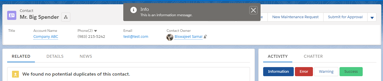
showInfo : function(component, event, helper) {
var toastEvent = $A.get("e.force:showToast");
toastEvent.setParams({
title : 'Info',
message: 'This is an information message.',
duration:' 5000',
key: 'info_alt',
type: 'info',
mode: 'dismissible'
});
toastEvent.fire();
},
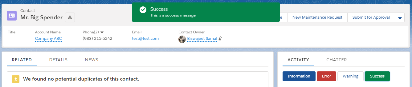
showSuccess : function(component, event, helper) {
var toastEvent = $A.get("e.force:showToast");
toastEvent.setParams({
title : 'Success',
message: 'This is a success message',
duration:' 5000',
key: 'info_alt',
type: 'success',
mode: 'pester'
});
toastEvent.fire();
},
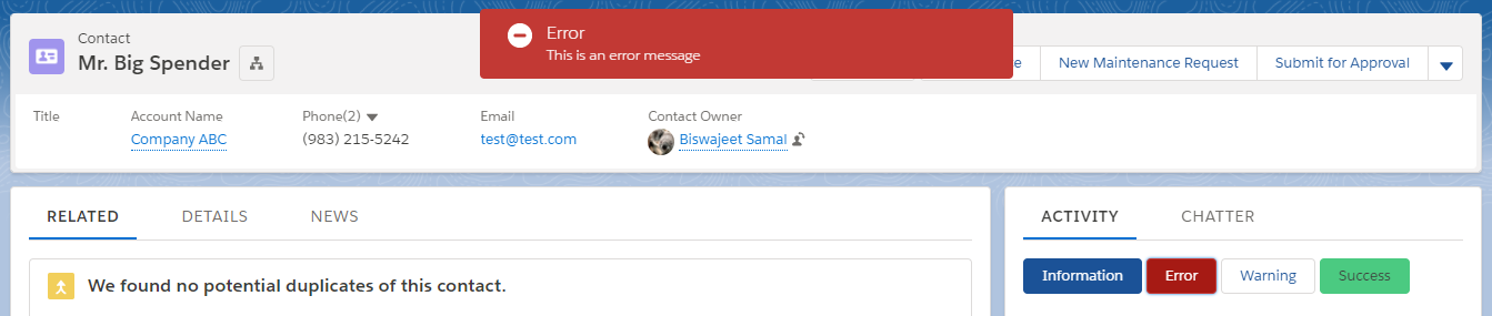
showError : function(component, event, helper) {
var toastEvent = $A.get("e.force:showToast");
toastEvent.setParams({
title : 'Error',
message:'This is an error message',
duration:' 5000',
key: 'info_alt',
type: 'error',
mode: 'pester'
});
toastEvent.fire();
},
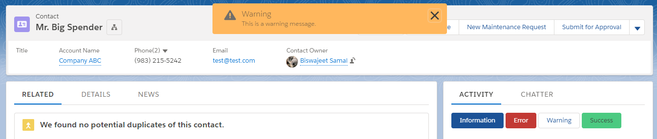
showWarning : function(component, event, helper) {
var toastEvent = $A.get("e.force:showToast");
toastEvent.setParams({
title : 'Warning',
message: 'This is a warning message.',
duration:' 5000',
key: 'info_alt',
type: 'warning',
mode: 'sticky'
});
toastEvent.fire();
}
})
Output: