We can use User.UITheme and User.UIThemeDisplayed in Visualforce Page to determine User Experience Theme.
User.UITheme : Returns the theme that is supposed to be used.
User.UIThemeDisplayed : Returns the theme that is actually being used.
User.UITheme and User.UIThemeDisplayed will return following values.
- Theme1—Obsolete Salesforce theme
- Theme2—Salesforce Classic 2005 user interface theme
- Theme3—Salesforce Classic 2010 user interface theme
- Theme4d—Modern “Lightning Experience” Salesforce theme
- Theme4t—Salesforce mobile app theme
- Theme4u—Lightning Console theme
- PortalDefault—Salesforce Customer Portal theme
- Webstore—Salesforce AppExchange theme
Sample Code:
<apex:page>
    <apex:pageBlock title="Theme">
        {!$User.UITheme}
        {!$User.UIThemeDisplayed}
    </apex:pageBlock>
</apex:page>
- Advanced PDF renders Visualforce pages as PDF files with broader support for modern HTML standards, such as CSS3, JavaScript, and HTML5.
- To use Advanced PDF, set
renderAs="advanced_pdf" in the apex:page tag of a Visualforce page with API version 40.0 or later.
- Advanced PDF supports in both Lightning Experience and Salesforce Classic.
- It is similar to the existing process for rendering a Visualforce page as a standard PDF file.
Example:
<apex:page readOnly="true"
           standardController="Account"
           applyHtmlTag="false"
           sidebar="false"
           showHeader="false"
           cache="true"
           renderAs="advanced_pdf"
           docType="html-5.0">
    <head>
        <meta http-equiv="Content-Type" content="text/html;charset=UTF-8" />
        <style type="text/css">
            @page {
            size: A4 landscape;
            border: 1px solid black;
            padding-left: 5px;
            padding-right: 5px;
            }
            th {
            font-weight: bold;
            text-align: center;
            background-color: #92d5f0;
            color: black;
            padding: 8px;
            }
            td {
            font-size: 15px;
            text-align: left;
            padding: 8px;
            }
            table{
            border-collapse: collapse;
            }
            table, th, td {
            border: 1px solid black;
            }
        </style>
    </head>
    <center>
        <h3>{!Account.Name}</h3>
    </center>
    <table width="100%">
        <tr>
            <th>Name</th>
            <th>Phone</th>
            <th>Email</th>
        </tr>
        <apex:repeat value="{!Account.Contacts}" var="con">
            <tr>
                <td>{!con.Name}</td>
                <td>{!con.Phone}</td>
                <td>{!con.Email}</td>
            </tr>
        </apex:repeat>
    </table>
</apex:page>
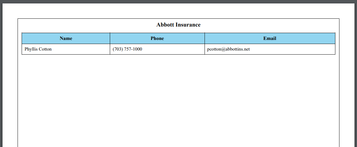
Output:
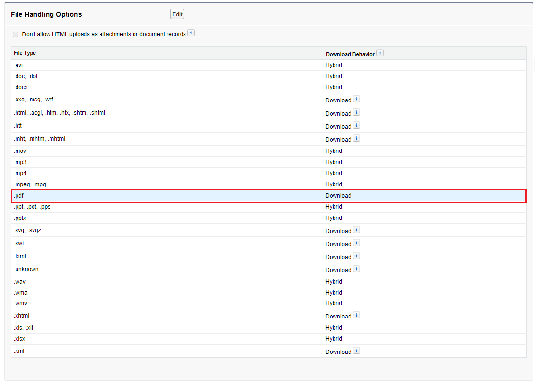
Enable PDF Download Option in Salesforce :
From Setup enter “File Upload and Download Security” in the Quick Find box | Click on Edit | Select PDF Download option | Click on Save
Lightning Component:
<aura:component implements="force:appHostable,flexipage:availableForAllPageTypes,force:lightningQuickAction">
    <lightning:button variant="brand" type="button" label="Cancel" title="Cancel" onclick="{!c.handleCancel}"/>
</aura:component>
Lightning JS Controller:
({
    handleCancel : function(component, event, helper) {
        //to close the quick action modal
        $A.get("e.force:closeQuickAction").fire();
    },
})
Sample Code:
Messaging.SingleEmailMessage email = new Messaging.SingleEmailMessage();
//You can use Highest, High, Normal, Low, Lowest email priority
email.emailPriority = 'Highest';