Tag Archives: Lightning Component

Salesforce Lightning Accordion

lightning:accordion component groups related content in a single container. Only one accordion section is expanded at a time. When you select a section, it’s expanded or collapsed. Each section can hold one or more Lightning components.

Here is an example of Lightning Accordion. I’m retrieving a list of contacts from Salesforce and populating into the Lightning Accordion.

Apex Controller:

public class AccordionAuraController {
    @AuraEnabled
    public static List<Contact> getContacts(){
        List<Contact> contactList = new List<Contact>();
        contactList = [SELECT Id, Name, Email, Phone, MailingStreet, MailingCity, MailingState, MailingPostalCode, MailingCountry From Contact LIMIT 10];
        return contactList;
    }
}

Lightning Component:

<!--Accordion.cmp-->
<aura:component controller="AccordionAuraController">
    <aura:handler name="init" value="{!this}" action="{!c.doInit}"/>
    <aura:attribute name="conList" type="List"/>
    <div class="slds-m-around_xx-large">
        <lightning:accordion>
            <aura:iteration items="{!v.conList}" var="con">
                <lightning:accordionSection name="{!con.name}" label="{!con.Name}">
                    <aura:set attribute="body">
                        <p>Street : {!con.MailingStreet}</p>
                        <p>City : {!con.MailingCity}</p>
                        <p>State : {!con.MailingState}</p>
                        <p>Postcode : {!con.MailingPostalcode}</p>
                        <p>Country : {!con.MailingCountry}</p>
                        <p>Email : {!con.Email}</p>
                        <p>Phone : {!con.Phone}</p>
                    </aura:set>
                </lightning:accordionSection>
            </aura:iteration>
        </lightning:accordion>
    </div>
</aura:component>

Lightning Component JS Controller:

({    
    doInit: function(component){
        var action = component.get('c.getContacts');
        action.setCallback(this, function(response){
            var state = response.getState();
            if(state === 'SUCCESS' && component.isValid()){
                //get contact list
                component.set('v.conList', response.getReturnValue());
            }else{
                alert('ERROR');
            }
        });
        $A.enqueueAction(action);
    }
})

Lightning Test App:

<!--Test.app-->
<aura:application extends="force:slds">
    <c:Accordion />
</aura:application>

Output:

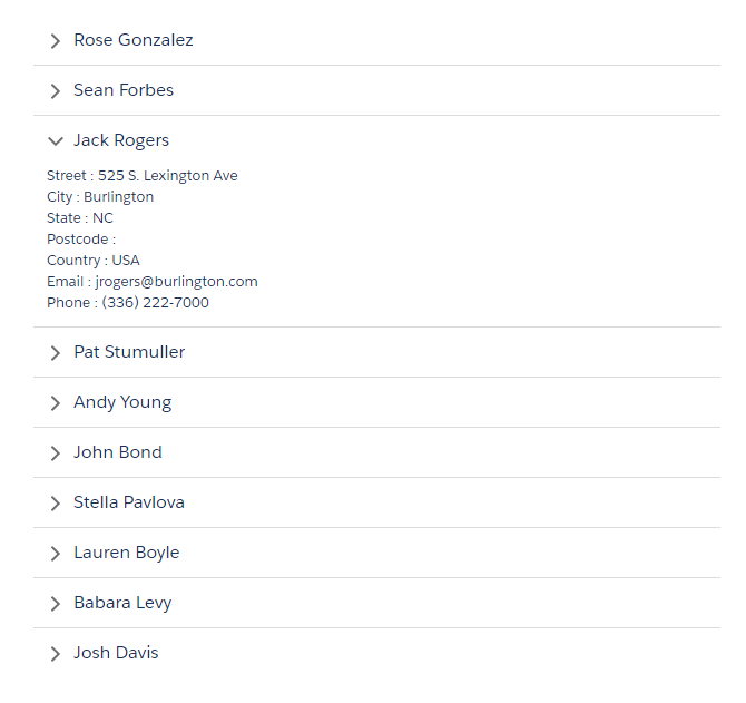
Note: The first section in the lightning:accordion is expanded by default. To change the default, use the activeSectionName attribute in lightning:accordion component. This attribute is case-sensitive. If two or more sections use the same name and that name is also specified as the activeSectionName, the first section is expanded by default.

Combobox in Lightning Component

Sample Lightning Component:

<!--Sample.app-->
<aura:component>
    <aura:attribute name="statusOptions" type="List" default="[]"/>
    <aura:handler name="init" value="{!this}" action="{!c.doInit}"/>
    <div class="slds-m-around_xx-large">
        <!--Combobox Component-->
        <lightning:combobox aura:id="selectItem" name="status" label="Case Status"
                            placeholder="Case Status"
                            value="new"
                            onchange="{!c.handleOptionSelected}"
                            options="{!v.statusOptions}"/>
    </div>
</aura:component>

Sample Lightning Component JS Controller:

({
    doInit: function (component, event, helper) {
        var options = [
            { value: "new", label: "New" },
            { value: "Working", label: "Working" },
            { value: "Escalated", label: "Escalated" },
            { value: "Closed", label: "Closed" }
        ];
        component.set("v.statusOptions", options);
    },
    handleOptionSelected: function (cmp, event) {
        //Get the string of the "value" attribute on the selected option
        var selectedValue = event.getParam("value");
        alert("Selected Option: '" + selectedValue + "'");
    }
})

Lightning Test App:

<!--Test.app-->
<aura:application extends="force:slds">
    <c:Sample />
</aura:application>

Output:

Tooltip or Helptext in Lightning Component

A lightning:helptext component displays an icon with a popover containing a small amount of text describing an element on screen. The popover is displayed when you hover or focus on the icon that’s attached to it. This component is similar to a tooltip and is useful to display field-level help text. HTML markup is not supported in the tooltip content.

Sample Lightning Component:

<!--Sample.app-->
<aura:component >
    <div class="slds-m-around_xx-large">
        <div class="slds-form-element">
            <lightning:input aura:id="email" placeholder="Please enter your email" required="true" type="email" label="Email" name="email" />
            <!--Helptext and tooltip component-->
            <lightning:helptext iconName="utility:info" content="Your email address will be your login name" />
        </div>
    </div>
</aura:component>

Lightning Test App:

<!--Test.app-->
<aura:application extends="force:slds">
    <c:Sample />
</aura:application>

Output:

Find Out Which Button was Clicked in Lightning Component

To find out which button was clicked in a component containing multiple buttons, we can use Component.getLocalId().

Here is an example with multiple lightning:button components. Each button has a unique local ID, set by an aura:id attribute.

Sample Lightning Component:

<!--Sample.cmp-->
<aura:component>
    <aura:attribute name="clickedButton" type="String" />
    <div class="slds-m-around_xx-large">
        <p><b>You Clicked: {!v.clickedButton}</b></p>
        <br/>
        <lightning:button aura:id="button1" name="btn1" label="Click Me" onclick="{!c.buttonClick}"/>
        <lightning:button aura:id="button2" name="btn2" label="Click Me" onclick="{!c.buttonClick}"/>
    </div>
</aura:component>

In the JS controller, we can use one of the following methods to find out which button was clicked.
event.getSource().getLocalId() returns the aura:id of the clicked button.
event.getSource().get("v.name") returns the name of the clicked button.

Sample Lightning Component JS Controller:

({
    buttonClick : function(cmp, event, helper) {
        var clickedBtn = event.getSource().getLocalId();
        alert(clickedBtn);
        cmp.set("v.clickedButton", clickedBtn);
    }
})

Lightning Test App:

<!--Test.app-->
<aura:application extends="force:slds">
    <c:Sample />
</aura:application>

Output:

Progress Indicator in Lightning Component

Progress Indicator Component:

<!--ProgressIndicator.cmp-->
<aura:component >
    <aura:attribute name="selectedStep" type="string" default="step1"/>
    <div class="slds-m-around_xx-large">
        
        <lightning:progressIndicator currentStep="{!v.selectedStep}" type="base">
            <lightning:progressStep label="Step One" value="step1" onclick="{!c.selectStep1}"/>
            <lightning:progressStep label="Step Two" value="step2" onclick="{!c.selectStep2}"/>
            <lightning:progressStep label="Step Three" value="step3" onclick="{!c.selectStep3}"/>
            <lightning:progressStep label="Step Four" value="step4" onclick="{!c.selectStep4}"/>
        </lightning:progressIndicator>
        
        <div class="slds-p-around--medium">
            <div class="{!v.selectedStep == 'step1' ? 'slds-show' : 'slds-hide'}">
                <p><b>Step 1</b></p>
            </div>
            <div class="{!v.selectedStep == 'step2' ? 'slds-show' : 'slds-hide'}">
                <p><b>Step 2</b></p>
            </div>
            <div class="{!v.selectedStep == 'step3' ? 'slds-show' : 'slds-hide'}">
                <p><b>Step 3</b></p>
            </div>
            <div class="{!v.selectedStep == 'step4' ? 'slds-show' : 'slds-hide'}">
                <p><b>Step 4</b></p>
            </div>
        </div>
        
        <div>
            <button disabled="{!v.selectedStep != 'step1' ? '' : 'disabled'}" class="slds-button slds-button--neutral" onclick="{!c.handlePrev}">Back</button>  
            <aura:if isTrue="{!v.selectedStep != 'step4'}">
                <button class="slds-button slds-button--brand" onclick="{!c.handleNext}">Next</button>
            </aura:if>
            <aura:if isTrue="{!v.selectedStep == 'step4'}">   
                <button class="slds-button slds-button--brand" onclick="{!c.handleFinish}">Finish</button>  
            </aura:if>
        </div>
    </div>
</aura:component>

Progress Indicator Component JS Controller:

({
    handleNext : function(component,event,helper){
        var getselectedStep = component.get("v.selectedStep");
        if(getselectedStep == "step1"){
            component.set("v.selectedStep", "step2");
        }
        else if(getselectedStep == "step2"){
            component.set("v.selectedStep", "step3");
        }
         else if(getselectedStep == "step3"){
            component.set("v.selectedStep", "step4");
        }
    },
    
    handlePrev : function(component,event,helper){
        var getselectedStep = component.get("v.selectedStep");
        if(getselectedStep == "step2"){
            component.set("v.selectedStep", "step1");
        }
        else if(getselectedStep == "step3"){
            component.set("v.selectedStep", "step2");
        }
        else if(getselectedStep == "step4"){
            component.set("v.selectedStep", "step3");
        }
    },
    
    handleFinish : function(component,event,helper){
        alert('Finished...');
        component.set("v.selectedStep", "step1");
    },
    
    selectStep1 : function(component,event,helper){
        component.set("v.selectedStep", "step1");
    },
    selectStep2 : function(component,event,helper){
        component.set("v.selectedStep", "step2");
    },
    selectStep3 : function(component,event,helper){
        component.set("v.selectedStep", "step3");
    },
    selectStep4 : function(component,event,helper){
        component.set("v.selectedStep", "step4");
    },
})

Lightning Test App:

<!--Test.app-->
<aura:application extends="force:slds">
    <c:ProgressIndicator />
</aura:application>

Output:

Note: To create “base” style progress indicator you have need to add type="base" attribute in your lightning:progressIndicator tag in lightning component.