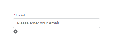
A lightning:helptext component displays an icon with a popover containing a small amount of text describing an element on screen. The popover is displayed when you hover or focus on the icon that’s attached to it. This component is similar to a tooltip and is useful to display field-level help text. HTML markup is not supported in the tooltip content.
Sample Lightning Component:
<!--Sample.app-->
<aura:component >
    <div class="slds-m-around_xx-large">
        <div class="slds-form-element">
            <lightning:input aura:id="email" placeholder="Please enter your email" required="true" type="email" label="Email" name="email" />
            <!--Helptext and tooltip component-->
            <lightning:helptext iconName="utility:info" content="Your email address will be your login name" />
        </div>
    </div>
</aura:component>
Lightning Test App:
<!--Test.app-->
<aura:application extends="force:slds">
    <c:Sample />
</aura:application>
Output: