Lightning Web Component(LWC) Toast Messages
Biswajeet
November 28, 2020 3 Comments on Lightning Web Component(LWC) Toast Messages
A component can send a toast notification that pops up to alert users of a success, error, or warning. A toast can also simply provide information. To display a toast notification in Lightning Experience or Lightning communities, import ShowToastEvent from the lightning/platformShowToastEvent module. Here is the example to show Lightning Web Component(LWC) Toast Messages.
Toast Event Properties:
| Parameter | Type | Description |
|---|---|---|
title |
String | (Required) The title of the toast, displayed as a heading. |
message |
String | (Required) A string representing the body of the message. It can contain placeholders in the form of {0} ... {N}. The placeholders are replaced with the links on messageData. |
messageData |
String[] or Object | url and label values that replace the {index} placeholders in the message string. |
variant |
String | Changes the appearance of the notice. Toasts inherit styling from toasts in the Lightning Design System. Valid values are: info (default), success, warning, and error. |
mode |
String | Determines how persistent the toast is. Valid values are: dismissable (default), remains visible until you click the close button or 3 seconds has elapsed, whichever comes first; pester, remains visible for 3 seconds and disappears automatically. No close button is provided; sticky, remains visible until you click the close button. |
LWCToastMessage.html:
<template>
<lightning-button label="Success" onclick={showSuccess}></lightning-button>
<lightning-button label="Error" onclick={showError}></lightning-button>
<lightning-button label="Warning" onclick={showWarning}></lightning-button>
<lightning-button label="Information" onclick={showInfo}></lightning-button>
</template>
LWCToastMessage.js:
import { LightningElement } from 'lwc';
import { ShowToastEvent } from 'lightning/platformShowToastEvent';
export default class LWCToastMessages extends LightningElement {
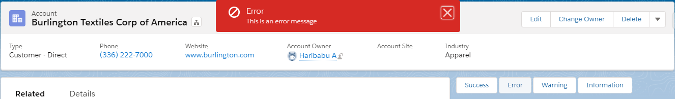
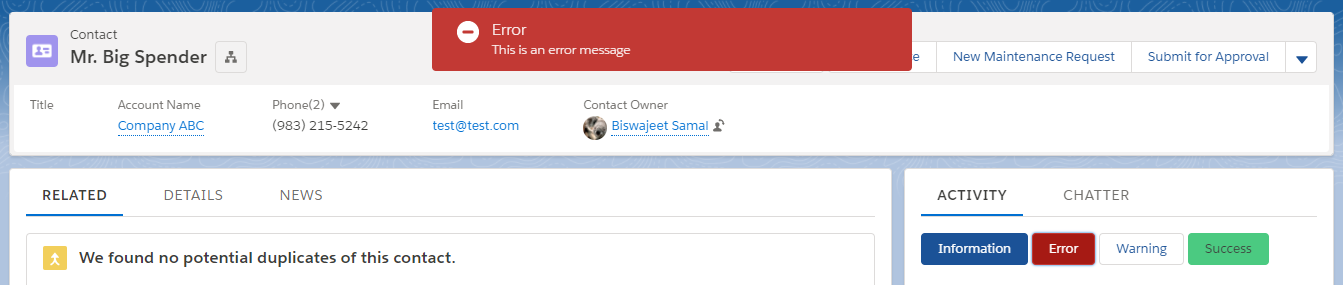
showError() {
const evt = new ShowToastEvent({
title: 'Error',
message: 'This is an error message',
variant: 'error',
mode: 'dismissable'
});
this.dispatchEvent(evt);
}
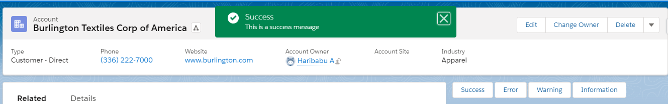
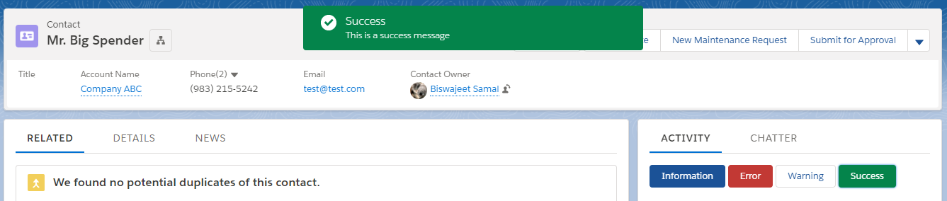
showSuccess(){
const evt = new ShowToastEvent({
title: 'Success',
message: 'This is a success message',
variant: 'success',
mode: 'dismissable'
});
this.dispatchEvent(evt);
}
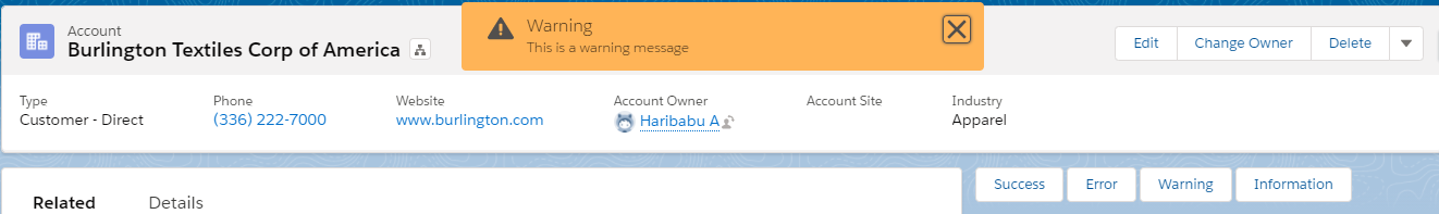
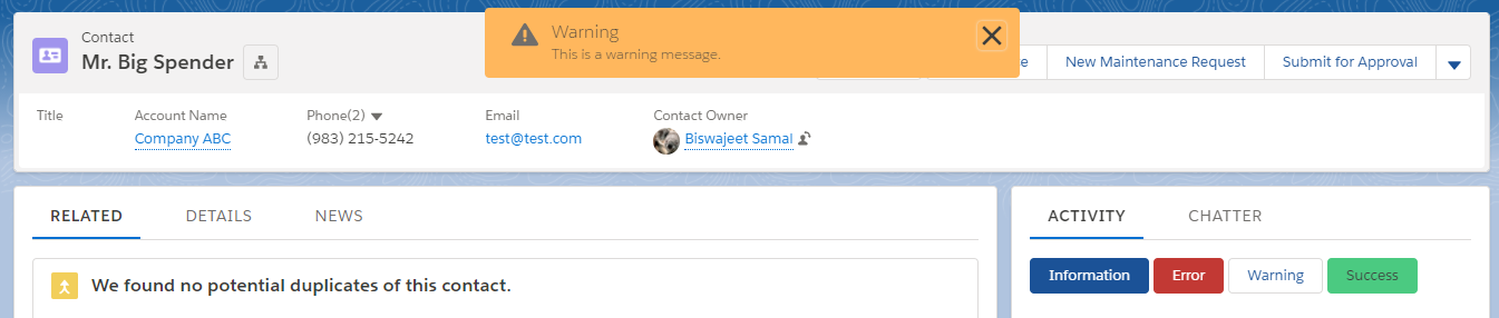
showWarning(){
const evt = new ShowToastEvent({
title: 'Warning',
message: 'This is a warning message',
variant: 'warning',
mode: 'dismissable'
});
this.dispatchEvent(evt);
}
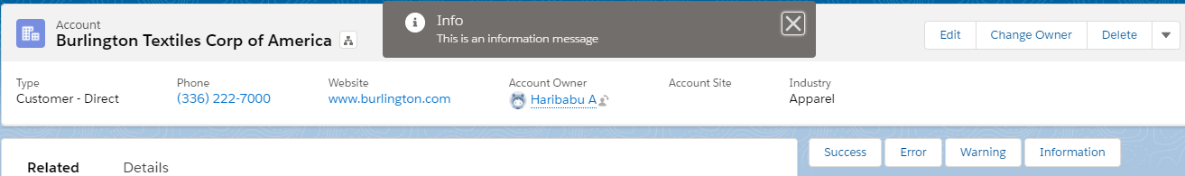
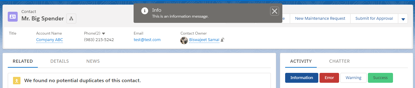
showInfo() {
const evt = new ShowToastEvent({
title: 'Info',
message: 'This is an information message',
variant: 'info',
mode: 'dismissable'
});
this.dispatchEvent(evt);
}
}
LWCToastMessage.js-meta.xml:
<?xml version="1.0" encoding="UTF-8"?>
<LightningComponentBundle xmlns="http://soap.sforce.com/2006/04/metadata">
    <apiVersion>50.0</apiVersion>
    <isExposed>true</isExposed>
    <targets>
        <target>lightning__AppPage</target>
        <target>lightning__RecordPage</target>
        <target>lightning__HomePage</target>
    </targets>
</LightningComponentBundle>